Simba App
Client Standard Chartered
Agency Hi Mum Said Dad
Role Branding & UI
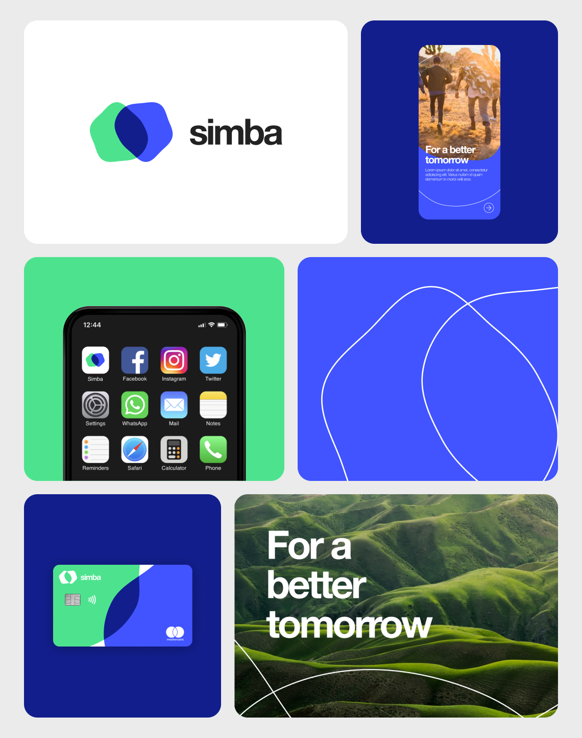
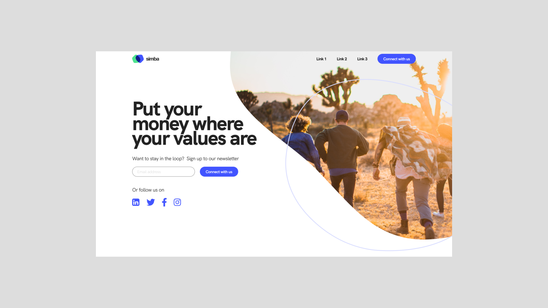
My primary role in this project was to define a bold new brand identity—one that seamlessly merges sustainability with smart investing. Inspired by the organic forms of tree rings and topographic maps, I developed a design language that reflects growth, balance, and long-term impact.
The fluid aesthetics shaped everything from the logo to the app’s interface, creating a cohesive visual system that feels both dynamic and grounded. The interplay of overlapping organic shapes, a fresh color palette, and a clean typographic approach ensures the brand resonates with a younger, future-focused audience.
As a subsidiary of Standard Chartered, the project remains under NDA for now—but more details will be revealed soon.